Reflection Of Year One (Unit 9 3.2)
In order to continue my journey towards my dream career in the games industry, I have decided that I should reflect on my first year of college, how that could have altered my career goals and how I will achieve those goals.
During my first year in games development, I was taught the basics of game design, the game industry and the roles inside the industry. One of the main skills I was taught how to do is to develop 3D models using 3DS max, some of the skills learned being how to modify a model and how to texture a model using UVW Maps. I felt that this was my strongest subject during the first year.
The next skill I was taught is how to use the unreal engine to create a playable game environment that has interactions with objects that have been imported from 3DS Max, some other skills that I learned for the engine where how to create collisions with each object, how to add sounds to my environment and how to create doors that open.
Another Skill I was taught was to sound creation, this included a wide variation of subjects that were creating foley sounds using everyday objects, script writing so I could record my voice in a controlled environment and sound mixing using audacity to make the sounds fit in with the theme of the project. I felt this was my weakest subject during the year because I had a hard time understanding sound mixing.
The last skill I was taught was how to create concept art, this included learning about how to set moods and emotion towards a particular scene using colour, shape and shading. I was also tasked with creating concept art around themes like having an emergency situation.
This was to set us up for our final project, where I decided to create pixel art animation to showcase character development, to portray how the art form effects how a character moves and how to show emotion through character movement. I enjoyed this the most last year because of the creative freedom we had during this project.
My goals for last year were to become a games graphics designer, although that had changed and evolved over the course of last year when I found out that it wasn’t a games graphic designer that works on the 2D art in games, it was the 2D games artist. But I also had found out that during the last couple of years, 2D games have been seen less and The industry is more focused on 3D games, so from both of those changes I have set my goal to become a 2D/3D artist with multiple other roles also becoming an interests like a concept artist and a voice actor.
So I can get to my desired career, I have multiple goals I would like to achieve before I get to that point. My short-term goal is to look for placements in universities or internships that would help get the qualifications I require. My mid-term goal is to develop my skills towards my desired career while I achieve those qualifications. And my long team goal is to enter the games industry and work my way up from an entry-level job.
Research and Analysis of Characteristics (Unit 9 1.1)
Recently we have been learning about how a character is portrayed and how that affects their designs, we are doing this to help us develop our understanding towards designing our own characters. To further my knowledge of character design I will be deconstructing the key characteristics of two contrasting characters and then compare them to each other. The characteristics I will be focusing on are their appearance, personality, how they move, the way their voice sounds and the audience for that character.
Pit

The first character I will be analysing is Pit from the Kid Icarus series.
Appearance
The appearance for Pit portrays him as a young teenager with puffy brown hair and bright blue rounded eyes, he wears a white tunic with black undergarments underneath as well as brown accessories and brown boot-like sandals, he also has two bright white wings and a golden leaf crown on his head, most of his design has smooth curves. This all suggests that he is a very positive, carefree person that might be rather cheeky at times, he is also not very intimidating but is very loyal, as an addition to this in most of his concept art for Kid Icarus Uprising shows him with a more serious and focused face. He was designed to look that way to portray an angel which is commonly known to serve gods and most angels are depicted as children or youth (more reminiscent of a putti) especially with the popular angel Cupid and according to Esaak, S. (no date) as seen in Renaissance, Mannerist, Baroque and Rococo art. According to Rikard (2015) white usually has a positive connotation and brown suggests stability and denotes masculine qualities.
Personality
Before Pit was given a personality in Kid Icarus Uprising, he was a rather bland character like most other characters during the NES era. He is a rather chirpy character which is mentioned multiple times by other characters like Dark pit saying “Annoyingly Cheerful” during Chapter 6 of Kid Icarus Uprising. He is also really cheeky mostly joking around with Palutena. He is very loyal to Palutena but also keeps an optimistic personality while being very focused on the task that is given to him.
Movement
Pit’s movement varies depending on which weapon he is using in the game but is usually keeping his movement focused. He also likes to show off before he faces medusa and other bosses with a rally cry. During his walking animation, he skips around a little, This is to continue portraying him as an upbeat character that is trying to make the most out of his missions.
Voice
Pit’s voice is very cheerful and bubbly, which is explained by Antony Del Rio during an interview with VideoGameHeat in 2012 where he says that he was given a vague description of pit “Young, Bubbly” which in turn decided how pit should sound in Kid Icarus Uprising.
Audience
The audience for Pit is most likely like the character for his attitude towards his missions and where he likes to have fun during the course of the game. I personally like pit because of both for his design and how he is voiced, I like listening to pit reference other game universes and continuation to break the 4th wall.
Bowser Jr

The second character I will be looking at is Bowser Jr from the Mario Series.
Appearance
The appearance of Bowser Jr is of a small, rounded dragon-like turtle that also has a humanoid body with a shell that includes small spikes on the back. he also wears a bib with a mouth with sharp teeth drawn on. his colours consist of Yellow, Green and a few oranges and reds. His rounded body that, according to Bradley (2010) would suggest a comforting and warm feel, but with the spikes added to his shell and his bibs teeth would suggest aggressiveness and action. His colour scheme also help shape his character, yellow is seen as a lighthearted and childish colour but also can be seen as unstable or a spontaneous colour, while the green suggests a lack of knowledge and in some cases safety and the orange suggests strength and endurance. (Rikard, 2015)
Personality
Bowser Jr’s personality is one of a young child looks up to their father and wants to follow in his footsteps, the only problem is that his father is Bowser, king of the koopas, who spends most of his time kidnapping Princess Peach. He is also very childish sometimes throwing tantrums once defeated by Mario but is also very loyal to Bowser and his troops.
Movement
Bowser Jr is rarely seen outside of his Koopa Clown Cart or other mechs but in New Super Mario Bros for Nintendo DS, He has a rather basic run animation where he just swings his arms and legs while he slightly leans forward. The main focus is how he attacks Mario, he aggressively runs straight at him.
Voice
Bowser Jr is seen talking in only one game, Super Mario Sunshine, where he sounds childish and naive. This gives the impression of a mischievous troublemaker. His voice is not to high pitch, yet not too low of a pitch either making Bowser Jr sounding a young boy. He also talks at a moderate speed that doesn’t add much to his personality.
Audience
Bowser Jr’s audience would tend to cater towards people who like a mischievous character that both looks cute and villainous at the same time. I personally like Bowser Jr because of his loyalty to his father in helping take over the mushroom kingdom and stopping Mario.
Evaluation
From conducting this research in to the two contrasting characters as well as analysing them each aspect of them has helped me advance my understanding towards the reasons why a character is designed in a certain way while trying to link a personality as well as a design together to make a character feel more alive. This research has also helped me gain the knowledge I need to know when it comes to designing my own character, from his appearance to his voice.
Sources
Robotortoise. (No Date) Pit dramatic pose e3 2011 press kit. Available at: http://kidicarus.wikia.com/wiki/Pit?file=Pit_dramatic_pose_e3_2011_press_kit.png (Accessed: 20th September 2016).
Sora Ltd (2012) Kid Icarus Uprising [Computer game]. Nintendo UK
Hal Laboratory (2012) Super Smash Bros. For Wii U [Computer game]. Nintendo UK
Angelprincess2431 (2012) Kid Icarus: Uprising – Is Dark Pit Doom and Gloom, or is Pit Annoyingly Cheerful?. Available at: https://www.youtube.com/watch?v=yWP-CGmi_D4 (Accessed: 20th September 2016).
GameXplain (2012) Kid Icarus Uprising – Chapter 9 – Medusa’s Final Battle Playthrough (Gameplay Footage). Available at: https://www.youtube.com/watch?v=0yMWxs_aYoQ (Accessed: 20th september 2016).
Rikard. (2015) ‘The Psychology of Color: A Designer’s Guide to Color Association & Meaning’, Zeven, 28th February 2015. Available at: http://www.zevendesign.com/color-association/ (Accessed: 21st September 2016).
Esaak, S. (no date) About Education. Available at: http://arthistory.about.com/cs/glossaries/g/p_putti.htm (Accessed: 21st September 2016).
VideoGameHeat (2012) Interview with Antony Del Rio “Voice of Pit” in Kid Icarus Uprising – VGH Exclusive!. Available at: https://www.youtube.com/watch?v=5smSSCaJP_E (Accessed: 21st September 2016).
YoshiKong. (2013) Bowserjr MP9.png. Available at: http://www.mariowiki.com/images/thumb/9/9f/Bowserjr_MP9.png/250px-Bowserjr_MP9.png (Accessed: 21st September 2016)
Bradley, S. (2010) The Meaning Of Shapes: Developing Visual Grammar. Available at: http://vanseodesign.com/web-design/visual-grammar-shapes/ (Accessed: 21 September 2016).
Nintendo (2002) Super Mario Sunshine [Computer game]. Nintendo UK
Luigi’s Gaming Anime Network (2010) Super Mario Sunshine – Mama Peach. Available at: https://www.youtube.com/watch?v=gLMaCvX7Bg8 (Accessed: 21th September 2016).
❤Sunny❤ (2016) New Super Mario Bros. DS – All Tower Boss Fights (Bowser Jr. Boss Fight Compilation). Available at: https://www.youtube.com/watch?v=TXGrUqqfZ54 (Accessed: 21th September 2016).
Lego Batman Adaptation Analysis (Unit 9 1.1, Unit 10 1.1)
To further my understanding towards designing a character for a specific target audience, I will be looking at the Lego Batman series and look at how batman was adapted for the Lego games and their audience. I will also analyse a character from the batman series and compare him to his Lego adaptation within the Lego Batman games. The game I will be focusing on is Lego Batman: The Video Game.
Who is the game for?
Lego Batman: The Video Game is targeted with children in mind as shown by the PEGI rating which has been set to ages 7 and up. This has been implemented because of the use of use of cartoon violence and the use of weaponry like guns, boomerangs and swords that of which have been simplified for the younger audience. (Common Sense Media, No Date)
How have they adapted the style for that game?
There have been multiple different Batman adaptations from the Adam West live action series where it was all slapstick humour using outrageous gadgets and wacky vehicles to the dark and more brooding style of the Christopher Nolan batman trilogy, but they all follow a common theme of serving justice by stopping super villains that try to take over Gotham city but doing it while using iconic gadgets like the batarang or the grappling hook. These have all been taken in to play when adapting batman in to Lego for the game, letting batman’s gadgets and vehicles become useful for progression through each level and by keeping a semi dark theme which is common in most batman adaptations while adding the humour from the Adam West batman series.
Is the shift in the style of the Lego games consistent?
The style of the batman in the Lego games stays the same throughout the Lego batman series while also evolving to better adapt to the modern adaptations of batman. This becomes visible when you compare each game to the films and comics at the time, while the first Lego Batman game came out during the Christopher Nolan trilogy was being created it followed the audience of the Batman cartoon series to get the designs for characters. Lego Batman 2 took it a bit further and went to keep what the first Lego batman did but also introduce more characters from other DC related comics like superman and the justice league to increase their audience while also creating a story which still follows the original idea of the first game but connects it using a hub world. And finally Lego Batman 3 continued to spread out across more DC characters even bringing more obscure characters and letting the player explore multiple different worlds in the DC universe.
Analyse a character from the novels/films and how it has been adapted for Lego?


In Lego Batman: The Video Game all characters from the Batman series have all been designed to take the shape of a Lego minifigure. Nightwing keeps his design from the comics with a few alterations to fit in with the Lego style, for a start his suit’s sleeves become blue instead of black with blue going over the shoulders, his hair has become a lot spikier compared to his hair in the novel/comics. He also manages to keep his blue dual combat batons which, for the Lego games, he used two blue clear pipe like pieces.
Evaluation
From this task, I have furthered my understanding of the adaptation of one series in to another series with a different demographic. this will help me in the future when it comes to figuring out the demographic of Street fighter and how that can be adapted in to the Lego franchise.
Sources
Daniel, T. (2009) Dick Grayson as Nightwing. Cover of Detective Comics #851. Available at: https://en.wikipedia.org/wiki/Nightwing#/media/File:Nightwing_DC_851.jpg (Accessed: 28th September 2016).
Danjam. (2009) Nightwing2. Available at: http://lego.wikia.com/wiki/Nightwing?file=Nightwing2.jpg (Accessed: 28th September 2016).
CommonSenseMedia (No date) LEGO Batman: The Videogame. Available at: https://www.commonsensemedia.org/game-reviews/lego-batman-the-videogame (Accessed: 28th September 2016).
IGN (2012) PEGI. Available at: http://uk.ign.com/wikis/content-ratings/PEGI (Accessed: 28th September 2016).
pitcherst (2008) The Best of 1966 Batman/Bruce Wayne. Available at: https://www.youtube.com/watch?v=RLZQ3OLEJWE (Accessed: 29th September 2016).
Traveller’s Tales (2008) Lego Batman: The VideoGame [Computer game]. Warner Bros. Interactive Entertainment.
Redesigning a Character (Unit 9 1.1, Unit 10 1.1)
Knowing the audience for a character is an important part of designing a character so it can fit in with what that key audience would like to see in their games, so to further my knowledge on the audience for a character I will be looking at one of the characters that I looked at last week during my character study on two contrasting characters and then redesign that character for a different audience. The character I will be focusing is Pit.
Pit is the main protagonist of the Kid Icarus series originally released in the later part of 1986 in Japan. The game was mildly successful, only selling 1.75 million copies worldwide with a handheld sequel, Kid Icarus: of myths and monsters released for the Nintendo Gameboy only 5 years later. After an 17 year absent from the gaming market came back in Super Smash Brothers Brawl in 2008 with a new redesign, which continued on to his own game, Kid Icarus Uprising, which was released for the Nintendo 3DS in 2012 which sold 1.27 million copies worldwide.
Pit was created in 1986 but had a redesign in 2008 for super smash brothers brawl and Kid Icarus uprising with a focus on modernizing the character for the children and young teenagers approximately around 12 to 16-year-old but to also allow fans of the previous games to feel familiar. Kid Icarus is well-known for its NES era difficulty that isn’t insultingly hard, which is great for people who like a challenge. He was designed to look like an angel with a lot of Greek mythology behind his design with the game also including gods and monsters from Greek mythology. Pit is a character that is created to be very relatable to the long time Nintendo fan, making multiple mentions to various different game series. a notable part of pits design is the fact that he has wings but is unable to fly.
If I were to redesign pit, I would recreate him for a mature western audience similar to the God of War series (SIE Santa Monica Studio, 2005), a series that also uses Greek mythology to create its story and characters. I would also look in to the age group of theses games being young adults of 18 to 36 years old. The way I would design pit is to make him keep his design origin from the Greek Mythology but make him look more like the Gods with the main design looking a lot like Zeus (Muñoz, 2011). I would keep pits colour scheme of white, brown and gold as it shows where, According to Rikard (2015), white shows his purity as an angel and positive connotations and the brown suggests stability. I would make Pit’s build more broad as well as making him appear older, this is to give him more of a square look which would make him seem stronger and more stable, while also making him seem cold and uninviting (Creative Bloq Staff, 2016) compared to his warm and upbeat personality. I would make his body and wings come up with scars and cuts to show the battle damage he would have been on missions for Palutena.
Evaluation
By furthering my research in to character design as well as the recreation of a character for a different audience, my knowledge of character design and audience has strengthened up a lot more as well. This will help me with creating my own character while keeping a specific target audience in mind as well as choosing that target audience.
Sources
http://www.vgchartz.com/game/6307/kid-icarus/ 3rd october 2016
SIE Santa Monica Studio (2005) God Of War [Computer game]. PlayStation Store.
Muñoz, S (2011) Jupiter, the Roman god of the sky, with his lightning bolt. Available at: https://www.flickr.com/photos/seattlesandro/5383975707/ (Accessed 3rd October 2016)
Rikard. (2015) ‘The Psychology of Color: A Designer’s Guide to Color Association & Meaning’, Zeven, 28th February 2015. Available at: http://www.zevendesign.com/color-association/ (Accessed: 21st September 2016).
Creative Bloq Staff (2016) The psychology of logo shapes – a designer’s guide. Available at: http://www.creativebloq.com/logo-design/psychology-logo-shapes-8133918 (Accessed: 3rd October 2016).
Character Study 1 – Ryu Animation (Unit 9 1.1, 1.2, Unit 10 1.2)
Recently we have been looking at the character animations of existing Street Fighter characters particularly from Street fighter V so we can get an idea of how our characters will move when fully animated. so what we will be doing is recreating Ryu’s Idle animation to get an idea on how our characters idle loops will end up looking like as well as improving our animation skills.
The video below shows my recreation of Ryu’s Idle pose as well as the reference video that has been taken from Street Fighter V (To get the full experience, right-click on the video and select the “Loop” option.)
The complete animation came down to 22 frames of animation that also links back to itself so it can continuously looped. It was created using the auto key feature that has been implemented with 3DS max which both sets the key frames and decides how it would flow together creating a smooth animation without setting multiple keys to get movement. Using auto key I was able to select a specific frame and move the object (or in this case a bone of the rigged model) to the place I would like the animation to move too.
Evaluation
This task was both easy and enjoyable as I got to learn how to produce 3D animations as well as improve my knowledge on using 3DS max. The task wasn’t too difficult and I adapted to animating really quickly although I would go back and edit a few of the key frames to make the animation seem less stilted.
Pixel Art – Ryu (Unit 9 1.1)
Recently we have been learning about creating characters that are recognizable but mainly focusing on the visual aspects that shape the familiarity of that character with the silhouette and colour palette. So to do that we looks for an existing sprite of Ryu from the street fighter series and recreated him with the restriction of 16×16 pixels.

First of all I had to shape my image using my limited pixels using the pencil tool, I made sure that I looked back at the reference image so I can sort out any adjustments that could have been made to make the shape as close to the reference as possible.
Once the silhouette was created, I started adding some basic colours down to create Ryu’s signature idle look, I had to use different shades of each colour to add shading make define the edges and curves of the character.
Evaluation
This task was really enjoyable and easy to complete. while doing this task, I improved my pixel art as before I used to create pixel art with an outline to mark where limbs or cloths have taken over and I now use a lot more shading to create the limbs and define where they start and where they end. I had no problems with this task but I did ask for feedback from my peers to see what changes I could use to make my work better, of which most of it was just experimenting with pixel positioning.
Source
http://www.neogaf.com/forum/showthread.php?t=947716&page=3
Comparing the Lego Audience to the Audience of Street Fighter (Unit 9 1.1, Unit 10 1.1)
Recently, I have been researching the audiences of both the Lego and the Street Fighter franchises to help me design my own Lego street fighter character for our current project. To help me continue my research, I will be researching and comparing the Street Fighter and Mortal Kombat games to see which game would be more appropriate for the audience of the Lego Franchise.
The Lego games and the Street Fighter games both have a large fan base both being well-known franchises by both adults and children knowing what they are. Both games are can be played with friends and family and use bright colours to create an inviting tone for the younger audiences, they are both action based and have a comedic appeal to theme at the same time and both have a wide range of playable characters so everyone has their favourites. The main differences for the audiences come in when you see how the games are laid out, the Lego games are co-op multiplayer so you can play along side a friend to complete a level together while Street Fighter is more of a competitive experience.
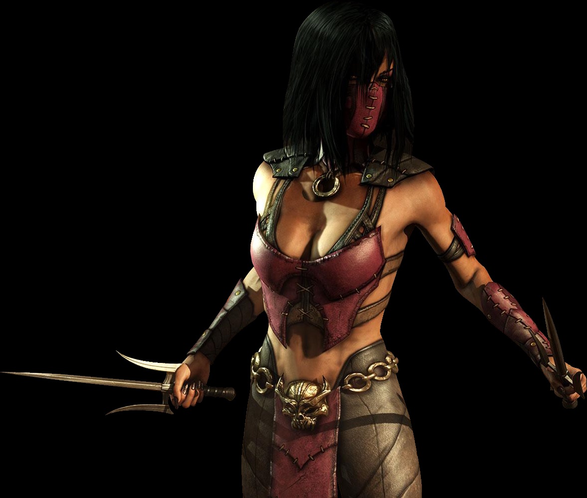
Street Fighter would be more appropriate for the Lego franchise than Mortal Kombat X because while they are both competitive fighting games, they have a different representation towards how they introduce violence in each game. This becomes apparent when you see the fatalities in Mortal Kombat that are shown in the video Mortal Kombat X – All Fatalities (deathmule, 2015) and compare them to the critical arts in Street Fighter V shown in the video Street Fighter V – All Critical Arts (DrewTony’Z, 2016). The way characters are portrayed are also apparent when comparing the games, Mortal Kombat X goes for a style close to almost resemble a realistic look while Street Fighter has a more cartoony style to it. Some of the characters clothing in both games can be considered to be revealing, this is apparent with Rainbow Mika from Street Fighter V where her outfit show off her rear, she also uses her rear in her critical art where she and her partner both run in and use their bottoms to drive their opponent’s head in to the ground. In Mortal Kombat X‘s case, they have changed the clothing of most of their characters and focused more on making the female characters wear respectable clothing, a character that comes to mind is Mileena from Mortal Kombat X when she first appeared she had a questionable outfit on but when it came to MKX she got a more combat outfit which showed less that previous outfits but is still slightly revealing.
Both audiences for each games would enjoy a competitive game of player Vs player or computer controlled player there both 2D fighters with magic attacks and use of weaponry but the difference for the games come from the way there both presented to the audience, while Mortal Kombat X focuses on mutilating their opponents to achieve victory in a death battle would appeal to the adult gamer, Street Fighter V‘s cast of colourful characters and mild yet comical violence would both interest children and young adults both of the hardcore and the casual gamer communities.
There are a few problems that could come in to play with Street Fighter becoming apart Lego franchise. One of the major problems would come to the limited movement of Lego characters could become a factor when recreating the movements of different street fighter characters that have lots of bends within their attacks. Another problem that could come in to play is the different size variants between in characters in street fighter and how that could be applied to Lego’s usual standard for there minifigures. While there are a few problems that can come in to play, there are also quite a few positives about using street fighter in the Lego franchise, one of those positives being that the outfits of a few characters that could be considered sexualized when they are portrayed in Lego, they would become less sexualized thanks to the simple design of the minifigures.
Evaluation
By analysing and comparing the Audiences of Street fighter, Mortal Kombat and Lego, I have gained a stronger understanding of how a game is made appropriate for different demographics. This has helped me as it made me consider how both Street fighter and Lego would be designed around each audience.
Sources
deathmule (2015) Mortal Kombat X – All Fatalities. Available at: https://www.youtube.com/watch?v=2YxPFw7lfY0 (Accessed: 4th October 2016).
DrewTony’Z (2016) Street Fighter V – All Critical Arts (DLC Characters Included/Story Costume Preview). Available at: https://www.youtube.com/watch?v=a3T_9ZyDdwg (Accessed: 4th October 2016).
Marioryu (no date) R. Mikaclean.png. Available at: http://streetfighter.wikia.com/wiki/R._Mika (Accessed/downloaded: 4th October 2016).
Venage237 (no date) Mileena (MKX).jpg. Available at: http://villains.wikia.com/wiki/Mileena (Accessed/downloaded: 4th October 2016).
Character, Audience And Audio – Ryu (Unit 9 1.1, Unit 10 1.1)
Recently we have been looking at character audio and how it is used to tell us about a character’s personality. Audio is an important part of creating atmosphere for an environment and helping a player gain more understanding of a character’s personality. So for this task I will be examining Ryu’s Voice clips from Street Fighter II (Capcom 1993) and then comparing them to his most recent appearance in Street Fighter V (Capcom 2016) to see how is voice as changed between each game.
First of all we will be looking at Ryu’s voice clips from Super Street Fighter 2 by looking at the video Super Street Fighter II VOICE Collection(ChikiyoKONAMI, 2009). From this video we can see that Ryu’s voice clips are very short and there are very few of them, this was probably due to the developers wanting to save space on the hardware due to the limited amount of space on earlier game systems and arcade cabinets, this also explains why the only voice clips that are present are for all of Ryu’s special moves and his knock out sound. The voice clips that are present for Ryu does not do a good job at portraying his character as all the sounds, this is present when you compare Ryu’s sound clips to Ken’s sounds clips, When you listen to them both voices sound similar with the major difference being that Ryu’s are alot more slower than Ken’s, this helps define Ryu as a calm and steady character but that is the only thing it does do.
The next game we will be looking at is Street Fighter V(Capcom, 2016) using a video called Street Fighter V: Japanese vs English Voices | All Characters [Launch] HD(ADAPT Chance, 2016) to look at Ryu’s voice clips. The amount of voice clip’s for Ryu has been expanded as well as the quality of the voice clips compared to the voice clips from Street Fighter II(Capcom, 1993), this time he doesn’t just grunt and say the names of special moves, he also talks in sentences which also helps us get a better idea of Ryu’s personality that convey a focused and determind fighter that has alot of respect for his opponents. He also has a deepened and slow voice which is specific only to his character, compared to the same voice that is used by multiple characters in SFII. All of this is possible due to the higher storage space on modern game systems.
When comparing both voice clips to each other, you can tell that Ryu’s voice has evolved since Street Fighter II because of the upgraded hardware, all though even with the limited storage during the time that Street Fighter II was developed they still managed to portray Ryu’s personality as much as possible.
Evaluation
By analysing and comparing Ryu’s voice clips from Street Fighter II and Street Fighter V, I have furthered my understanding of audio and how audio is used to portray a characters personality. This knowledge has also helped me consider how I should make my character sound when I think about his personality.
Source
Capcom (1993) Super Street Fighter II [Computer game] Capcom
Capcom (2016) Street fighter V [Computer game] Capcom
ChikikyoKONAMI (2009) Super Street Fighter II VOICE COLLECTION. Available at: https://www.youtube.com/watch?v=ZMmKUTxLms8 (Accessed: 7 October 2016).
Character Pose Speed Drawings (Unit 9 2.2)
Recently we have been looking at the animations of different characters from the street fighter series, particularly with Ryu and Birdie for their differences in build. So for this task, we have been asked to develop your drawing skills by drawing there idle and special poses with set time limits of 30 seconds, 1 minute, 2 minutes and 3 minutes. During the task a few drawings had extra challenges added to like not taking the pencil off the page or not stopping while drawing.
Ryu
Birdie
Evaluation
Once this task was completed, I felt like my drawing skills had improved tremendously in the case of how fast I could draw and maintain the quality of drawing that I had being developing beforehand. It was difficult to get around the time limit at first but I quickly adapted and completed the task to a satisfactory standard. I could improve more by giving my self time to practice.
Character Study 2 – Birdie Animation (Unit 9 1.1, 1.2, Unit 10 1.2)]
Continuing from the previous character study where we looked at recreating Ryu’s idle animation. What makes this task different is the fact that the body proportion of Birdie is a lot larger than Ryu, so we will be recreating birdies idle to the best of our abilities using a character model that has a standard body proportion.
The video below shows my recreation of Birdie’s Idle pose as well as the reference video that has been taken from Street Fighter V (To get the full experience, right-click on the video and select the “Loop” option.)
The complete animation came down to 270 frames of animation that also links back to itself so it can continuously looped and just like the Ryu idle animation, It was created using the auto key feature.
Evaluation
This task was slightly difficult to complete but was still enjoyable as I got to improve my animation skills within 3DS Max. when it came to this task, I had no problems getting around the larger proportions of Birdie but I was unable to animate his fingers due to running out of time on the task. If I had more time to complete the animation I would continue animating the fingers and also make the animation feel a lot more human as the animation looks slightly choppy.
Pixel Art – Birdie (Unit 9 1.1)
Continuing from the previous pixel art task where we looked at recognizable characters by focusing on their visual aspect when we created some pixel art of Ryu’s idle pose. This time we will be looking at re-creating a pixel art version of birdie but this time we will be looking at creating a pixel art animation of Birdie’s Bullhead special attack from Street Fighter V. (The Video below is Birdie’s Bullhead animation.)
Like the Ryu animation, we started off creating the silhouette to get the shape of the character and from there we created the idle animation adding the detail to get the lighting and shading.
After the Idle was created, we had to create the second frame, where birdie pulls back and gets ready to unleash the bull head but this time we didn’t create a silhouette, instead we worked from both the idle frame for the colour and placement of birdie and a screenshot of the bull head animation taken from SFV.
Once the second frame was created, we created the third frame using the same method that we used on the second frame.
Now that all three key frames were created it was time to create the animation. Using Photoshop built-in timeline feature, we set each frame as it’s on frame for the animation and selected how much time each frame would be delayed by to get the full impact as the birdie bull head. This is how the final animation turned out.
![]()
Evaluation
I was really happy with how the final animation turned out and has also helped further my skill with pixel art animation. The task it’s self was really easy as its something I had self-taught myself during my final major project last year.
Character, Audience And Audio – Birdie (Unit 9 1.1, Unit 10 1.1)
Recently we looked at how audio is used to portray a character’s personality by looking at Ryu’s voice from Street Fighter II and Street Fighter V. I am going to continue looking at character audio by analysing Birdie’s voice clips from Street Fighter Alpha: Warriors’ Dream(Capcom, 1995) and then comparing them to his voice clips from Street Fighter V(Capcom, 2016).
(Birdie’s voice clips start at 2:10)
The first game we will be looking at is Street Fighter Alpha: Warriors’ Dream(Capcom, 1995) by using the video Street Fighter Alpha (ARC) OST – Voice Collection (Vox Nihiki, 2012), Just like Ryu’s clips from Street Fighter II (Capcom, 1993), there are very few of Birdie’s voice clips and each on is very small due to the limitations of hardware on the gaming platforms at the time, but while the voice clips are small, Birdie has a distinct voice that links just to him within game, this voice is really deep and slow does a really good job of portraying Birdie as a large and powerful character which suits the character really well.
(Birdie’s voice clips start at 15:59)
The next game I will be looking at is Street Fighter V (Capcom, 2016) using the video Street Fighter V: Japanese vs English Voice | All Characters [Launch] HD (ADAPT Chance, 2016) for all of Birdie’s voice clips. Just like Ryu, The amount and quality of Birdie’s Voice clips have been expanded on when compared to Street Fighter Alpha: Warriors’ Dream(Capcom, 1995). There is a distinct difference between how he talks in both games, as where before he just had a deep and slow voice, in Street Fighter V (Capcom, 2016) he speaks in a slightly higher pitch, and also has a British cockney accent which wasn’t present in his previous appearance on the series, these help us understand a lot more about Birdie by telling us that he is British, his voice also sounds like his mouth is also full, this tells us that he is a glutenous character.
When comparing the voice clips from each games to each other, you can tell that the personality of Birdie was changed between each game, while at first it didn’t tell us much about his character apart from that he was a large and powerful character, when he was changed in Street Figher V, (Capcom, 2016) it tells us that while he is large he is also a glutenous character.
Evaluation
By examining and comparing the differences between Birdie’s voice clips from Street fighter Alpha And Street fighter V I have gained a better understanding on character audio and how it changes between different games in a series and how they portray a character’s personality. This knowledge will be able to help me with future development when thinking about how my character would sound if he had different personalities.
Sources
Capcom (1995) Super Street Fighter Alpha: Warriors’ Dreams [Computer game] Capcom
Capcom (2016) Street fighter V [Computer game] Capcom
Vox Nihili (2012) Street Fighter Alpha (ARC) OST – Voice Collection. Available at: https://www.youtube.com/watch?v=ZMmKUTxLms8 (Accessed: 26 October 2016).
Venn Diagram (Unit 10 1.1)
Following the comparison between the Street fighter series and the Lego Franchise, we decided to create a Venn Diagram to show the differences and similarities to help determine if the street fighter would be appropriate for Lego’s target audience.

From the diagram you can see that the are a variety of differences and similarities between the audiences of both Lego and Street fighter. Street Fighter would be suitable for the Lego audience but it might not be due to the suggestive themes and the competitive nature of the street fighter series, but the Lego games have worked their way around suggestive themes before with Lego Star Wars II: The Original Trilogy where in Episode 6 of Star Wars, Leia was given a golden bikini and when that was translated to Lego, thanks to the shape of the minifigures and the style of the faces, it didn’t affect the family audience that they were looking for.
Evaluation
From this Venn diagram, I have learned how different the audience of the Lego franchise is to the street fighter series. This has helped me figure out how my character should be designed to fit both franchises as well as helping further my knowledge of different audiences.
Pitch Preparation (Unit 9 1.2, 2.1, Unit 10 1.2)
To prepare for my up-coming pitch, I had to research and create two characters that can fit in to both the Lego franchise and the Street Fighter series. While doing this, I will be looking at the backstories of multiple other characters from the street fighter series as well as explaining the appropriateness to both Lego and Street Fighter.
Character 1 – Steve Chilli
Steve Chilli is a 23-year-old, white, American male who is a student at Dan Hibiki’s Saikyo Dojo and an employee of Hot Diggity, a hotdog company. His fighting style is the Saikyo, Dan Hibiki’s version of the Assassination Fist, but to differ himself from Dan, he uses condiments that he has stored in his pockets. His reason for entering the Street Fighter Tournament is to try to pay for the fee from Dan’s Dojo, his boss also found out about Steve’s addition to the Street Fighter tournament and decided to get him to wear a hotdog outfit while he is fighting for extra advertisement and extra pay for Steve Chilli.
Steve is a lazy and bored character who is only there for the money and not the actual tournament, to show that off more he should sound dull, and vague with a slightly deep voice. The audience that I am trying to appeal to are people who enjoy Joke characters, who aren’t there to play seriously but are there for a laugh with their friends. I believe he would be appropriate for both Lego and Street Fighter as joke characters already exist in the street fighter series and Lego have already created a Hot Dog Man minifigure.
Character 2 – Brian Heart
Brian Heart is a 35-year-old, white, Canadian male who specialises in Submission wrestling. Brian Heart is based on WWE hall of famer, Bret ‘Hitman’ Hart, who wrestled using lots of submission moves during his time wrestling. Brian Heart wears a black and pink singlet and speaks in a deep brash voice. He is a very friendly person that focuses on being the best and while he is usually calm, he can get aggravated at extreme moments.
His back story follows him after training in the Heart Dungeon by his father where he enters a wrestling business where he wins multiple championships, till one day where he has a match with Zangief, where Brian was defeated from Zangief’s spinning Driver which broke his neck, sending him out of action for two years. After those two years, he finds out that Zangief was entering a Street Fighter tournament, this allows him finally get his rematch and beat Zangief to finally be the best. The audience that I am trying to appeal to are people who enjoy wrestling, particularly submission based wrestlers. I believe he would be appropriate for both Lego and Street Fighter as wrestling characters are seen in both Lego with the wrestling champion and Street Fighter with Zangief and Rainbow Mika.
Evaluation
I am happy with how both characters have turned out and I do hope that they both have a positive feedback. I feel that my first character is my strongest in terms of development compared to my second character.
Legal and Ethical Considerations (Unit 9 1.1)
Recently we have been looking at character representations as well as their characteristics when it comes to stereotypes. So to continue this I will be looking out how black street fighter characters have been portrayed, referring to an article called Black Characters In The Street Fighter Series by TheZoneGamer (2016). By doing this I believe it will help me understand character representations.
I believe that Capcom most likely designed and re-designed multiple of these characters to allow themselves to create a more diverse character roster and broaden their audience to have a character that they can enjoy and attach themselves too.
There are two characters that come to mind when I think about this, with the first being Sean Matsuda, a young Brazilian child with dark-skin and a yellow gi similar to Ken and Ryus. According to TheZoneGamer(2016), it was believed that “Sean Matsuda was originally meant to be African-American rather than Brazilian but his nationality was changed when they added Ken to the SFIII series.” This could have been backed up with Sean Matsuda being known for playing basketball which is ” a sport that is usually affiliated with Americans and he is dark-skinned with kinky hair.” (TheZoneGamer, 2016).

The other character that comes to mind is Birdie, a character that first appeared in the Street Fighter as a “gangling, athletic white/light-skinned man with a blonde mohawk.” (TheZoneGamer, 2016) but was then later redesigned in Street Fighter Alpha as a British cockney punk rocker that is very reminiscent of the late 1970s. This lead to some questioning from fans of street fighter which was later addressed that “Birdie’s reason for his change of appearance is that he was ill, which made his skin turn pale.” (TheZoneGamer, 2016) Birdie was most likely redesigned to fill a more diverse role within the Street Fighter roster without the need for developing another character for that role.

The intended Audience for Birdie would follow the demographic that he has been designed for, people who would enjoy British punk rockers and would be familiar towards the late 1970s. This might have been changed with another redesign from Street Fighter V, where he gained a large stomach which made the character look “overweight and in addition looks dirty and rumpled.” (TheZoneGamer, 2016) “This drastic change in his physique from Alpha is disappointing and makes Birdie lose much of his appeal.” This change from a Large, hunched-back, muscular fighter to an overweight character with more of an interest in food would make him lose his original appeal but would cater towards a more casual audience who want to play a more comedic character.
From both of those characters, we can tell that the Street Fighter roster has a large amount of culturally diverse characters that show off their origins and characteristics from all around the world. Compared to other fighting games, Street Fighter is amazing when it comes to cultural diversity especially with the addition of multiple other characters from around the world, However, there is another game that comes to mind when it comes to cultural diversity and that is the Tekken series, where they don’t just have human characters from around the world, they also have animals from different locations and areas like Panda from China and Roger the kangaroo from Australia.
An example from Tekken that shows off their culture is Eddy Gordo, a Brazilian fighter who wears a Capoeira fighting outfit that has the colours of the Brazilian flag. Eddy can be compared to Laura from Street Fighter V, both of which that sport a Capoeira fighting attire with the Brazilian flag colours and braided hair. This it a common stereotype for Brazilian Fighters, however both fighters have a different fighting style as Eddy uses the Capoeira fighting style, which is naive to Brazil, that he learned from an unnamed old man and Laura uses the Matsudo Jujitsu fighting style that she learned from her grandfather, this helps Laura differ herself from the Brazilian stereotype.


While Street Fighter uses a few stereotypes to create a culturally diverse roster, there are a few games that don’t use stereotypes to create their characters diversity. A character that comes to mind is Achilles Davenport From Assassin’s Creed 3 and Rouge.

Achilles Davenport is an Assassin of Caribbean and British heritage, who has retired to the countryside of North America till Ratonhnhaké:ton (Later named Connor) comes by and asked to be trained in to the Assassin’s Order. Achilles is a very layback but only wants to be left alone, but allows Connor to gain residents once he has a change of heart. He doesn’t follow any stereotype of someone from the Caribbean as a fun-loving, positive people as Achilles is more calm and to himself wanting to relax and stay out-of-the-way from the modern civilization during war of independence.
Evaluation
By analysing and comparing these characters while focusing on cultural diversity and stereotypes within the game’s character designs, I have furthered my knowledge on why developers use stereotypes to create there characters. This will help me in the future when designing my character as it will make me think about stereotypes towards the location of origin for my character while also thinking about how that would appeal to multiple audiences.
Sources
TheZoneGamer (2016) Black Characters In The Street Fighter Series. Available at: http://www.thezonegamer.com/2014/02/black-street-fighter-characters.html (Accessed: 26th October 2016).
Marino (2016) Eddy Gordo Available at: http://www.giantbomb.com/eddy-gordo/3005-3530/ (Accessed 26th October 2016)
Street Fighter V (2016) Available at: http://streetfighter.com/characters/laura/ (Accessed: 26th October 2016).
dungbootle (2013) Achilles Davenport Available at: http://www.giantbomb.com/achilles-davenport/3005-24821/ (Accessed: 26th October 2016)
Pitch (Unit 9 1.2, Unit 10 1.2)
Recently, I had to prepare for the pitch by creating two characters, those characters where Steve Chilli and Brian Heart. From the pitch, I would like to proceed with the most popular character from the feedback that I am given and develop them further.
The first character I presented was Steve Chilli, who was the most popular out of both characters, most of the feedback I got was positive with most of them liking the concept of a hot dog mascot in a fighting game, with others suggesting that I look at creating an outfit that would work within the movement of a Street Fighter game.
The second character I presented was Brian Heart, who still gained some positive feedback mostly liking the concept of a submission wrestler entering the Street Fighter tournament but because of how Street Fighter is played a lot of people questioned how he would do his submission moves.
Evaluation
I was happy with the feedback that I had got during the pitch and has led me to continue developing Steve Chilli because of his popularity with my peers. I will continue developing him by looking at hot-dog outfits and developing multiple different concepts that would work within both Lego and the street fighter franchises.
Street Fighter: Assassin’s Fist Report (Unit 9 1.1, Unit 10 1.1)
How did the creators of the Street Fighter movies and games adapt the franchise for varying audiences?
The Street fighter movies and games were adapted for there varying audiences by using a variety of artistic styles and ways of story telling. Street Fighter: Assassin’s Fist (IFC Films, 2014) focused a lot on the source material created by Capcom using the existing story, but told in a serious manner using live action to portray the story. Using special effects to create the special moves as they would be seen in game, they target to please there hardcore game audience. Using these iconic moves and a existing plot, they please the existing street fighter audience yet by also creating a serious tone for an audience that like a serious story.
The Street Fighter II animated movie doesn’t follow any of the lore that was set during the game, but has its own story that connects each character together, in a plot that follows the search for Ryu between M.Bison and the team of Chun lee and Guile. The animation doesn’t do much to show moves that are seen in game but instead focuses on the characters and there bond with each other. It doesn’t to much to connect to the audience of the game apart from the existing characters.
The Hollywood Street Fighter movie doesn’t do anything for the lore of the street fighter series and was only created to take some money from the popularity of the street fighter games. this is furthered with the release of the Street fighter movie game which also uses the popularity of the street fighter series to create extra revenue.
How did the Street Fighter: Assassin’s Fist movie compare to the Hollywood and animated Street Fighter Movies?
While Street Fighter: Assassin’s Fist is a street fighter film created by fans, for fans using the existing material from the Street fighter series like moves and character backstories, the Street fighter II animated film does little to follow the story created in the street fighter 2 game yet does its best to connect the existing characters in a story that would make sense to the plot they are trying to create. The Hollywood Street fighter film however was only created to captivate on the success of the street fighter games with a really linear and generic action plot and questionable casting for characters that already have a diverse background.
How did the Street Fighter movie game compare to the Street Fighter 2 game?
The Street Fighter Movie game is very different when compared to Street Fighter 2, this is present with the choice of using there live action cast from the movie to create the animations for the characters instead of the pixel sprites used within street fighter 2. This design choice for the street fighter movie games creates a major departure from the rest of the street fighter games which creates awkward movements and a discomfort for fans of the series. This difference in design was chosen for the Street Fighter movie game was likely to promote the Street Fighter Movie by using the audience of the games to see the live action characters and story within the game, but this backfired due to the bad portrayal of the Street fighter film.
Which character in Street Fighter Assassin’s Fist appealed to you most? Explain why?
The character that appealed to me the most from the Street Fighter: Assassin’s Fist film is Ken due to his cocky attitude and character progression throughout the film. When the film started Ken was an arrogant and cocky person with impatient attitude towards his training, this is present with him constantly disobeying and questioning his Master Gouken. This first lead me to believe he would end up following a darker route which was furthered by him finding out about the Sadsui No Hado, but then was all sorted with Gouken explaining to Ken and Ryu about his brother Goki who was changed to Akuma from learning about the forbidden Sadsui No Hado. This changed Ken to be more focused on his training but still with his cocky personality and finding out that Ryu some how managed to be taken over by the Sadsui No Hado instead of Ken, who knocked out Ryu with a Fire Shoryuken and puts Ryu’s signature red headband to hold back the Sadsui No Hado.
Which Character in Street fighter 2: The Animated Movie appeal to you most? Explain why?
The character that appealed to me the most in The Street Fighter 2 animated movie was M.Bison. He appealed to be because of the mysterious and dark nature of the character as well as his dedication to capturing Ryu. He tries to achieve his goal by taking control of Ken using mind control and then using him to black mail Ryu in to joining Shadowlaw, He also sends his minions, Vega and Balrog to stop Guile and Chun lee from finding Ryu first.
Lego Character Move Story Board (Unit 9 2.1, 2.2, Unit 10 2.1, 2.2)
For our project for this term, we will be designing our own Lego Street Fighter Character with their own animations but we can not do that without knowing what their attacks will be. So to resolve this issue we have been tasked to create a storyboard showcasing the heavy damage, the heavy attack and critical art animations. Under each image is a small annotation of what his happening in the image itself.

Evaluation
This task was both extremely fun and creative when it came to creating the movements for our characters, this task ended up being a lot more active than originally anticipated as we loved around doing the animations to make sure that they are as accurate to human movement as possible without making them look choppy or unrealistic. The only problem I could see coming from this is we will be animating Lego characters instead of human characters. so some of the animations might be altered when creating the final product.
Lego Character Design (Unit 9 2.1, 2.2, Unit 10 2.1, 2.2)
Continuing from our character pitches, we were tasked with creating character concepts for our Lego Street Fighter Character. Since the most popular character out of the two character ideas was Steve Chilli the Hot dog man I will be creating character concepts of him. I will focus on having a continuous colour scheme that follows the usual colour scheme of a hot dog as well as making the character facial expressions look as bored and uninterested as possible with the traditional Lego styled faces. all work has been annotated on the images.
Starting off with the character concepts, I decided to try three different outfits all with a different feel to them, an all-in-one hot dog costume that is follows the usual design of a hot dog costume but with a bun collar and a sausage helmet instead of it being a part of the full outfit, a hot dog hoodie that follows more of a casual outfit that would most likely be worn by someone who isn’t planning on going out for too long, and a hot dog coloured suit that, while it doesn’t show laziness, it is commonly worn in an office job which is said to be a boring job.
After getting some feedback from my peers, it was decided that both the hot dog all-in-one costume and the casual hot dog hoodie were the most liked out of the 3 concepts. so from there I started to create more detailed concepts of the hot dog all-in-one and the hot dog hoodie, apart from making the concepts more detailed, I also had to work on the back of each outfit and include the logo of Hot Diggity company that Steve Chilli works for.
Once all the concepts for the character designs were done, I moved on to the Lego head concepts, here is where I decided to experiment with the original Lego yellow colouring as well as a change in eyes for one and a change between an open mouth and a straight mouth.
Evaluation
This task was quite easy yet entertaining to complete as it allowed me to be creative and look at different outfits and how they could represent a different feel for the character. I would like to point out that it was relatively difficult to work with the Lego templates that have been set for us prior to this task.
Audience and Character Analysis (Unit 9 1.1, 1.2, Unit 10 1.1, 1.2)
What do the articles tell you about:
- The traditional audience for fighting games?
- The appeal of fighting games to this audience?
- The problems in broadening that appeal to new audience demographics?
These articles tell us how the traditional audience for a fighting game is a competitive audience more than it is a casual one, this is backed up by Ben Moore (2016) that says “The game resonates most strongly with an audience that already ‘gets it’.” which he continues further saying “fighting games have their own terminology”, Kenneth Nussbaum (2014) backs this up by stating that “Marred by difficult controls, agonizing learning curves and detailed frame knowledge”. The appeal of fighting games towards an audience of people who show dedication towards the genre which is shown by both E-sports and the in-game ranked modes that reward players for learning their characters and figuring out how to uses them skillfully. This becomes an issue towards broadening an appeal towards a newer audience as it creates a steep learning curve for players that, according to Ben Moore (2016) could start “creating a mental barrier for a large number of people who think ‘this is too hard for me’.”.
How have developers tried to overcome these problems?
Developers have tried to over come this problem before with the example of Capcom attempting to bring a more casual audience by adding “a larger cinematic story mode add-on” (Michael Martin, 2016), this helps the game broaden their audience to players that enjoy a game’s storyline without players needing to master each characters more technical abilities. In the article “Why Street Fighter V Is More Than Just a Game” by Michael Martin (2016), Capcom’s Matt Dhalgren explains that “these updates will definitely help casual fans dive further into the world of Street Fighter V.”. Capcom even tried to further their approach towards a casual audience for Street Fighter with the introduction of the Focus Attack which allows newcomers to access a new mechanic which also wouldn’t affect the skilled players, this is solidified by Kenneth Nussbaum (2014) who stats that “It has its limitations when dealing with quicker attacks and you can still be thrown, but it gives new players an advanced tool at their disposal that’s fun and easy to execute.” The addition of these features, according to Matthew Javis (2015) helps make the game “approachable and accessible” to “a newer, younger audience”.
How could you apply this new knowledge to your ideas for your character?
- Consider age, gender, education, income, interests etc.
- Consider traditional audiences vs new audiences
I could apply this new knowledge to further my ideas for my character by thinking about making my character easy for newer players to pick up and learn without having over complicated mechanics for that character. I would also consider having a back story for my character that links in to the existing story by adding and mixing it with other character back stories. I would focus my character on being relatable towards an audience which could enjoy comedic characters that may seem out-of-place or would be used for a few laughs.
Do you think a Lego Street Fighter game might help to overcome some of these problems?
I believe a Lego Street fighter game would help overcome some of these problems as Lego is a product that is loved by multiple different audiences and while Lego is usually targeted for children, there is a large audience of adults that also enjoy Lego. By adding one franchise to another you help introduce people to another series which could also make them want to continue further in to that newly introduced series.
Sources
Nussbaum, K. (2014) Reinventing the fighting game genre, and appealing to a new audience. Available at: http://www.gamasutra.com/blogs/KennethNussbaum/20140321/213684/Reinventing_the_fighting_game_genre_and_appealing_to_a_new_audience.php (Accessed: 11 November 2016)
Jarvis, M. (2015) Capcom targets ‘newer, younger, eSports audience’ with Street Fighter V. Available at: http://www.mcvuk.com/news/read/capcom-targets-newer-younger-esports-audience-with-street-fighter-v/0158783 (Accessed: 11 November 2016)
Moore, B. (2016) The Turbulent Growth of the Fighting Game Community. Available at: http://www.escapistmagazine.com/articles/view/video-games/features/16915-The-Turbulent-Growth-of-the-Community-Around-Fighting-Games (Accessed: 11 November 2016)
Martin, M. (2016) Why Street Fighter V Is More Than Just a Game. Available at: http://www.redbull.com/us/en/esports/stories/1331779658839/why-street-fighter-v-is-more-than-just-a-game (Accessed: 11 November 2016)
Capcom (2016) Street fighter V [Computer game] Capcom
Characteristics of The Beat ‘em-up (Unit 9 1.1, 1.2)
What are the typical themes of the fighting game genre of video games?
- How does your character fit, adapt or subvert these themes? Why is this relevant?
What is the appeal of these games? Why do you think people play them?
What are the key conventions/characteristics of the genre?
- How could you use these to develop your character/concept?
How have other developers followed or adapted these characteristics for new interpretations of the genre? What can you learn from this?
What are the key gameplay elements?
- How does your character fit, adapt, or subvert these elements?
Identify examples cited in the article that could help you develop your character/concept?
- In what ways could they help inform your ideas?
Evaluation
Sources
Refine Characters (Unit 9 2.1, 2.2, Unit 10 2.1, 2.2)
Recently we created concept art for out Lego Street Fighter characters where I created some concept art of Steve Chilli, the Hot Dog man, where the most popular design was the hot dog all -in-one outfit. So for this task I will be refining the design of Steve Chilli within Adobe Photoshop so I have a better concept to work with when it comes to creating the character in 3DS Max for animation. This will also come in handy when it comes to creating the textures for the 3D model.
To start creating this we were provided with a Lego template to work on from so we could keep an outline of how the character should be shaped. I started off by creating the face using the pencil tool and a graphics tablet to get a smoother line, when it came to creating the eyes, I used a technique where I enlarged to the pencil to create a singular circle and then shrink it back so i can add the smaller details to then copy and mirror it so both eyes look exactly the same.
Once the face was completed, I moved on to creating the rest of the outlines for the outfit following the concept art that was previously created, this became somewhat of an issue as when I was using the graphics tablet to create the straight lines I would shake and the lines would end up looking rugged so to solve this issue i used the line tool and created a straight line that goes down through the torso to the leg piece to copy and then mirror it to the other side of the image. After the outline was completed, using the gradient tool and the paint bucket tool, I filled in the design with colours as well as an idea to make the bun colouring look lighter the closer it gets to the hot dog area. Soon after the colours were added, the hot diggity logo was added to the back of the design and I erased all unnecessary lines to get the final product.
Evaluation
I am very happy with the final product when refining the character concepts I created beforehand, while working on this task I looked back to my concept art a lot to make it look as good as I could. To improve this I would look at making the hood look a lot more like a hood as well as moving down the hot diggity logo.
Filming Character Animations (Unit 9 2.1, 2.2, Unit 10 2.1, 2.2)
Recently we have been preparing our characters to be created so they can be animated within 3DS Max, but before I can do that I need to record some reference videos, both from the side and the front of the character. Once they was recorded, we synced and trimmed down the videos with in Adobe Premiere Pro which are then saved as .avi files to be transferred and used to create our animations. The videos below show all my reference videos after being synced.
Idle Animation Reference
- Front
- Side
Attack Animation Reference
- Front
- Side
Taking Damage Animation Reference
- Front
- Side
Critical Art Animation Reference
- Front
- Side
These reference videos will be used within 3DS Max where they will be imported as a texture and attached to two planes that match the aspect ratio of the video and then used to help me set up each frame for the animations.
Evaluation
I enjoyed filming and editing the references videos to be used when creating the animations within 3DS Max. I didn’t have any problems when recording the reference videos but to make sure that I had the best possible animations, I did multiple takes.
Texturing (Unit 9 2.1, 2.2)
Recently we have been refine our characters ready to be created with in 3DS Max, but before I go on to animated my character, I have to texture them. this will be largely based off of my refined concepts of Steve chilli.
All of the textures were created in Photoshop using unwrapped UVW templates of each area of the character’s model. Each texture was created using the refined concept of the character to get accurate textures for each area. I also had to create UVW templates for both legs and the belt. The leg had to also be mirrored so that it can be different for each leg. Once all the textures where created they were applied to the model and created a 3D version of Steve Chilli as seen below.

Evaluation
I am happy with how the textures look when applied two the model, when creating the textures I had no problems apart from adding a texture to the wrists, this was sorted out quickly by hiding the hands and then applying the texture to the wrists. Now that the textures have been added to the model, I can move on to animating the character starting with his idle animation.
Idle (Unit 9 2.1, 2.2, Unit 10 2.1, 2.2)
Recently we created textures and applied them to 3D models within 3DS max, and now we will be furthering the development of those 3D models by creating four different animations. The first animation I will be working on will be the idle animation. The aim for this animation is to create an idle that would loop in to itself as well as show a bored expression through the animation using the reference videos created beforehand.
Before I was able to animate I had to set up the characters pose, this was done by selecting one of the cat bones on the model, entering the motion tab and turning on the setup/animation mode toggle, this is too make sure when I move the bones to pose the character the model won’t stretch and distort. Using two planes with the reference videos attached to them, I set up the start up pose to get ready to start animating the Idle. This pose is set up to allow a point of return for where the animation will start and end to create a loop. This is what the start up pose looks like.

Now that the character has been set up, its time to start creating the animation, to do this we used the “Auto Key” feature, (as used within the Ryu and Birdie animations) and starting with the key frames for the pelvis to get the start up the motion of the character, all I did for the pelvis was set up 3 frames that involves moving and rotating towards the left or right just slightly to give the character to look like he is swinging his hips. Once the pelvis was done I moved on to the shoulder, here I moved the shoulder up or down to get a lazy swing that would be continued in the arms. The arms were animated separately from the shoulder to make the left arm to move less than the right arm that would swing forward and around the front of the body and then clap to the side as the body returns to the middle and then to the other side and continue.
Once all the key frames were set, I adjusted the timing to make the body feel a lot more natural by making secondary movement within the animation. I did this by selecting the frames that I wanted to move and dragged them slightly further back or forth on the timeline. When the animation was completed I rendered the video to create what you see below. To get the full experience, right-click the video and select the ‘Loop’ option.
Evaluation
I am happy with the how the idle animation had turned out once it was completed and I also enjoyed creating the animation as well as furthering my animation skills. When creating the animation I had no major problems but where I did misclick on the model instead of the bone, this was solved by pressing Alt + X on the model and and freezing the model so I don’t select the model and only select the CAT bones.
Taking Damage (Unit 9 2.1, 2.2, Unit 10 2.1, 2.2)
Continuing from the Idle animation, the next animation I will be creating will be the taking damage animation. The aim for this animation is to make the character look like he is stumbling back from being hit and then return to the idle animation(which isn’t present with in this animation is instead replaced with the start up pose that it should return to when hit). Like the Idle animation, I had to apply reference videos on to the planes to give my self something to work from.
Unlike the other animation, I didn’t have to recreate the start up pose for the character as I used a different save of the last animation. There is about 10 frames between the start of the animation and where the hit would take place to get an idea of how it would play out.
The process of creating this animation was the same as creating the idle animations apart from the number of frames I used and the placements of frames and the model as the animation plays out, the major difference between the idle and the taking damage animation was the fact that I had to move the feet instead of leaving them in place. While creating this animation, I focused on making sure he doesn’t move to a different point so I can make the animation loop from the start up pose without the character walking forward or appearing in the start up point when looping. The full render of the animation is in the video below. To get the full experience, right-click the video and select the ‘Loop’ option.
Evaluation
I am very happy with how the taking damage animation turned out, while it was a bit more complicated than the idle animation, it was still relatively easy to complete. I had no difficulty completing this task but with the focus of keeping the animation in the same location got slightly difficult when using the reference videos, I resolved this by animating the reference videos to move forward instead of having the character move backwards so he follows the references closer.
Attack (Unit 9 2.1, 2.2, Unit 10 2.1, 2.2)
Continuing from the idle and taking damage animations, the next animation I will be developing will be the Attack animation. The aim for this animation is to make sure it can transcend from the attack animation seamlessly and back to the idle animation, I also want to make the attack look powerful.
Like the taking damage I didn’t have to repose the character for the start up as I created another save from a previous animation. This animation starts from the start up pose and goes straight in to the animation without a delay.
The creation process for this animation was very similar to the other animations in terms of what tools were used and the process of the animation. When creating this animation, I focused a lot on trying to create an impact from the attack so it would come out as a heavy attack, I did this by having a relatively slow wind up for the animation before a fast attack comes out and then a slow cool down to get back to the start up pose. Like the other animations, when I finish creating the animations I rendered them, the full animation render is below. To get the full experience, right-click the video and select the ‘Loop’ option.
Evaluation
I am really happy with how the attack animation had turned out overall. This animation was slightly more difficult than the taking damage animation as I had to make the character model turn quite quickly around to let out a large impact. While I had no problems creating the animation, I feel like I could have done a bit more to the animation to increase how powerful the animation could feel, this can be improved by a possible shake in the fist after the impact takes place.
Critical Art (Unit 9 2.1, 2.2, Unit 10 2.1, 2.2)
Continuing from the creation of the idle, taking damage and attack animations, the final animation I am going to produce will be Steve Chilli’s critical art. The aim for this animation is to create a powerful looking attack that also uses a particle effect to give the animation more life.
Instead of using a start up pose like the other animations, I created an extra copy of my idle animation and continued the animation from that animation to create the critical art. This animation plays one loop through the idle animation before transcending in to the critical art animation.
The development process was the same as the other animations, with the difference of using a particle effect. I created a super spray which can be founds in the particle systems tab when creating models, from there I loaded a preset animation for the hose, set the model to a mesh and then selected the meta particles option to create a mesh that would work and look like a liquid. There was one problem that I still had to fit when working with the particle effects, when the particle effect starts it would shoot straight up without stopping, this was fixed by creating a gravity bind that when applied to the particle effect would make the particles fall towards the direction of the gravity. This helped give the animation more weight to it.
I did three variations of the Critical Art, one has no particle animation and the others are two versions of the Particle effects. Both particle effects are the same apart from the colour of the texture used for each one, This is because the first particle effect uses a red texture to resemble ketchup, this was changed as it resembles blood and since the demographic of our characters are primarily children, it would be unfitting for the tone of the game. The second particle effect uses a yellow texture to resemble mustard which works a lot better for the demographic. each version of the critical art animation is below.
No Particles
Particle (attempt 1)
Particle (attempt 2)
Evaluation
I am happy with how the critical art animation as turned out, but I could have done more for the animation by adding camera angles as planned in the storyboard. The different camera angles where not completed because I have ran out of time to complete the critical art. However, with what I do have the only problem that i feel like i could resolve would be working on the timing alot more with the particle effect to make it seem like it came from a force of impact instead of a spray.
Scripting and Sound (Unit 9 2.1, 2.2)
Recently we have created the final animations for our character within 3DS Max with those animations being the Idle, Taking Damage, Attack and Critical Art animations. So for this task we will be creating sounds for the animations of our choice. This is to add some extra live to our animations. The animation I will be creating the sounds for will be the Critical Art.
Before I could create the sounds, I had to create a Sound asset list, this is to lay out what sounds I will need, where I will get them and If those sounds are copyrighted or not. Each sounds that was chosen have to link in to the critical art animation without being out of place when syncing with the critical art animation.

While only a few of the sounds were taken from Royalty Free websites, most of them were recorded specifically for this animation, those were created using foley, (reproducing sounds with everyday objects to create a new sound to be used with a specific purpose in mind) these were recorded to get the sounds that I would fit in with the character and the animation. The voice of the character was done by myself using a voice that would sounds bored and uninterested in what he is doing, I did this by lowering my own voice and slowing down my usual talking speed slightly. Each sound was recorded multiple times.
Once all of the audio was recorded, they were trimmed down within Audacity and then applied to the sound within Adobe Premiere Pro where they were synced and rendered together. The Critical art with the sound is below.
Evaluation
I am relatively happy with how the sounds had turned out but I felt like I could have done a lot better when it comes to syncing the audio. I had no problems when creating the audio but i didn’t use any of the sounds that I got from the Royalty Free websites as they took away from how the sound should have played out.
Evaluation (Unit 9 3.1, 3.2, Unit 10 3.1, 3.2)
For this term, we have been gathering the knowledge to understand the characteristics of a character and a franchise of which they use to create a fully understandable context which would then be applied to creating a target audience for that character or franchise. So to prove that we have a clear understanding for the theme of this project, we were set the task of creating a Lego Street Fighter character that, through animations and sound, would demonstrate that character’s characteristics within a fully understandable context while also catering to a target audience that would be shared with both the Lego and Street fighter franchises as well as creating the character’s own audience.
To prove my understanding of the project, I created a Lego Hot-Dog man named Steve Chilli, a character that has been created to cater towards a casual audience that plays fighting games with friends during parties or for people who enjoy characters that would make them laugh. I tried to do this by making the character both fit in to each franchises but would also stand out from the existing roster of characters set in the Street Fighter series, this was done by making the character have a silly costume on and having him enter only to pay for the debt that he was in.
This was done with a lot of research in to both the Lego and Street fighter series with most of the time focused on the audiences of each franchise and how they compare to each other with the goal of creating an ideal audience for the Lego Street fighter game concept. This was done by looking at existing Lego crossovers (we looked at the Lego Batman Series) and gathering an understanding of how both series were adapted to be enjoyed by both existing audiences, and then looking at the Street Fighter audience to gain an understanding of how Capcom is trying to broaden their audience towards both the casual and hard-core demographics without changing the formula that made that series successful. And with all that research on both franchises, we compared them to each other to see how adaptable they are to each other and see what both series have in common.
While I am happy with how the final design had turned out, there are both strengths and weaknesses within his design. Starting with the strengths, all of the animations show a clear understanding of the characters movements as well as the characteristics of Steve Chilli clearly, the colouring of the textures have come out amazingly following the colour scheme of a hot dog, his facial expression clearly shows a bored and uninterested look, each animation can smoothly transcend from the idle animation and back, and the audio created for the character helps forward the message that this character doesn’t exactly want to be there. While there are a lot of strong designs within this character, there are a few weaknesses that are also visible, most of the outlines that show each different area of the character are relatively thin and could be thickened, the gradient used to create the lighter areas of the hot dog bun is not as dominant as i would have liked and could be strengthened, a few black marks appear on the models texture could be removed, the colour of the hot dog could use a bit more saturation to give the colour a lot more life, and particle effect used in the critical art could use a bit more work in terms of speed when impact is realised.
When I was designing the character, I wanted to follow a theme of creating a character that would both be comical for the casual gamer and also relatable towards students who find themselves in debt. While looking at that theme, I wanted to look in to jobs that few people really enjoyed and a reason that someone would enter a competition that they wouldn’t normally participate in, this was influenced by stories of debt that were quickly solved with someone entering the lottery or a competition and successfully winning, and the constant news of mascots that get in to fights within New York. Those themes and influences helped me decide on creating a fighting mascot character with a goal of paying of the debt that he has been left in, and so I looked at the commonly thought of as stupid costumes and created Steve Chilli.
During the time I was working on my concepts for the design for Steve chilli, I decided to experiment with different ideas for costumes that would both give a different feel to the character but also follow the hot dog suit idea. The first design I created was an all-in-one hot dog suit with a large bun collar and a hot dog helmet, (reminiscent of the original Lego Spaceman Minifigure) which is closer to the final design than the other designs, this design was to follow the mascot idea and create a goofy look for the character. The second design I created was the hot dog hoodie, this design was to create a lazy and casual feel for the character with him putting no effort in to his outfit apart from the hot dog hoodie that he has to wear thanks to the company he works for. The third design that I created was a hot dog coloured suit, this design was to give the impression that he has an office job which is commonly known for being uninteresting and dull but this design had the problem of looking to smart and strays away from the silly idea. These different variations in design choices allowed me to get an idea of what the audience would say is the most popular out of all designs so I can create a design that they would follow.

There were a lot of key areas of development during this project, we started off by researching the characteristics of different characters and how they have been created for their audience to gain an understanding of how specific characteristic are chosen alongside each other to create an understandable character, this helped me decide the characteristics I was going to give my character when thinking of his design and personality. The next area we researched towards developing our character was looking at both the Lego and Street fighter franchises, focusing on how they can be adapted to each other and how their audiences compare to get an idea for the audience for the character we will be developing, this helped me by making me think and research the audience that I will be developing for and how my character would be able to fit within the audience of both games. We furthered our research on the street fighter franchise by looking at their characters in the case of diversity and how they are portrayed in-game, this helped me think about how to make my character fit in to his location of origin without trying to use stereotypes and to also consider diversity when developing my character.
As soon as I got all of the research for my character, I moved on to designing my character and the audience that the character would be intended for, during this time I also created some concept art of the character and explore different outfits, this allowed me to be creative and experiment when designing my character while looking at what my character would be wearing. Once I had some concepts of the character, I moved on to refining that design digitally to get a better idea of how my character would look when created in to 3D, this allowed me to continue developing my concept to make it feel a lot finer and professional. After we refined the character, we moved on to texturing and creating our character within 3DS Max, this was to give us more of an idea of how the character would look during animation. Once the textures where applied to the model, we animated our characters using reference videos we had filmed prior to the animation process to create the idle, attack, damage and critical art animations, this allowed me to put all my animating skills to the test to finally create a character that would show of all the research that I had done. Once that was done, we created sounds for the character’s animation, this was to add more life to the characters.
I believe that the final piece of work is appropriate for the needs of Lego as thanks to the creative nature of Lego, anything can exist, but in terms of the intended audience, he might not be light-hearted enough in terms of the character’s motives wanting to pay of a debt but there are other characters within the Lego games that have more questionable motives than my character. When thinking about the design of my character and how he would be appropriate to Lego, I look at existing Mascot characters like their Banana guy.
I believe that the final piece of work is appropriate for the needs of the Street fighter series as thanks to street fighters large roster of diversity within their characters, I was able to make any character that follows any area of the world. When creating a character that would fit in the Street Fighter franchise, I looked at existing joke characters like Dan Hibiki to get an idea of how the character should be portrayed.
I felt that the work went a lot better than I expected, this is because of the speed I was able to work at when creating my animations and how quickly I was able to adapt to the work flow. When asking for feedback on my final animations, a lot of my peers explained how they like how smooth the animations were and how they were able to transcend from the Idle animation almost seamlessly with the only problem being the particle effect from the critical art being slightly choppy and too fast for the intended idea.
I believe I could improve my work next time by spending more time on the animations and textures just to make them feel a lot smoother without any jolts or marks. I could also improve my work by thickening the outlines to make them feel more like a licensed Lego Minifigure.

November 21, 2016 at 10:39 am
Ross, I am impressed with your commitment to your work so far, you have worked well practically and have some good evidence of understanding audience and character.
There are areas in which you need to complete, although I am presuming these are works in progress.
The written work that you have done is good so far, although I found a common theme in your writing that it does not seem finished in each task. I have noticed that there is not a lot of reflection and evaluations as well as explaining your processes.
The practical tasks that you have done are brilliant, and you can see that you have worked hard on each of them, i feel that you are not explaining these processes in enough detail. Look at the practical tasks again and go through each them and break down what you did and why you did it. You will then find that your evaluations are going to be more detailed.
Your writing about character and audiences in a few of your blogs could be a little more detailed also, go back to the earlier blogs and pad them out a little more with descriptions.
I am pleased with your referencing on these tasks- keep up the good work! 🙂
LikeLike
November 30, 2016 at 11:11 am
Character Studies have been completed.
LikeLiked by 1 person
November 30, 2016 at 12:16 pm
Refining characters task has been completed
LikeLike
December 4, 2016 at 10:46 pm
Legal And Ethical Considerations, Pitch Preperation, Pitch, Filming animations and Texturing have been completed.
LikeLiked by 1 person
December 6, 2016 at 11:19 am
Idle animation completed
LikeLiked by 1 person
December 6, 2016 at 12:27 pm
Taking Damage animation has been completed
LikeLiked by 1 person
December 6, 2016 at 3:13 pm
Attack animation has been completed.
LikeLike
December 7, 2016 at 11:18 am
Critical Art Animation has been completed
LikeLike
December 7, 2016 at 6:38 pm
Sound and scripting has been completed
LikeLiked by 1 person
December 8, 2016 at 10:18 pm
The Character and Audio Tasks for Both Ryu and Birdie have been completed.
LikeLike
December 9, 2016 at 3:23 pm
Assasin’s Fist Report has been complete.
LikeLike